In 2024, at the time of the project's launch, the Silver Mercury brand was in a state where its visual and verbal identity no longer reflected its position in the industry or the internal changes it had undergone. In the rapidly evolving advertising and marketing industry, where visual differentiation and a cohesive brand image are critically important, SM’s identity had become outdated both aesthetically and substantively. In a competitive environment that includes both local and international awards, visual and communication solutions were more modern and cohesive. Despite quantitative growth (750 applications in 2023 and 1500 in 2024), SM faced a perception barrier: participants and the audience did not associate the brand with an ambitious and modern platform. A significant step towards a new brand became necessary. This marked the beginning of the transition from an award to an ecosystem.
Problem
The full rebranding project for Silver Mercury was initiated to solve a strategic task — to relaunch the brand, making it visually and content-wise relevant, aligning it with its actual scale, influence, and future goals. The rebranding covered all levels: from auditing the current positioning to developing the brand platform, a new design, and the entire system of visual communications. We went beyond just an update — we redefined the essence of the product itself. While most festivals (except for Cannes Lions, which sells recognition, and Effie, which sells effectiveness) “sell” only the “product” — participation, accolades, awards while we “sell” the effect. Silver Mercury today is not just a festival; it is a tool for realizing ambitions. We don’t sell a diploma, but a path to growth, opportunities, environment, status, and development. We want talents to earn money — we realize ambitions. Problem: The key challenge was the gap between the internal development of the brand and its external perception. Despite the objective growth of Silver Mercury in terms of participants, product offerings, and industry influence, its visual and verbal identity had become outdated and no longer reflected the brand’s ambitions, values, and scale. Silver Mercury's perception was often associated with something “old,” “illogical,” or “too formal”. Young professionals and agencies hardly associate the festival with something inspiring and innovative. Meanwhile, competitors, especially international ones, were actively investing in visual identity and digital experience. Other brands addressed similar issues by updating logos or redesigning websites, but this did not lead to a systemic transformation. The complexity of the project lay in the multi-level tasks, the need to preserve continuity and recognition, while following trends and modern design principles.
Solution
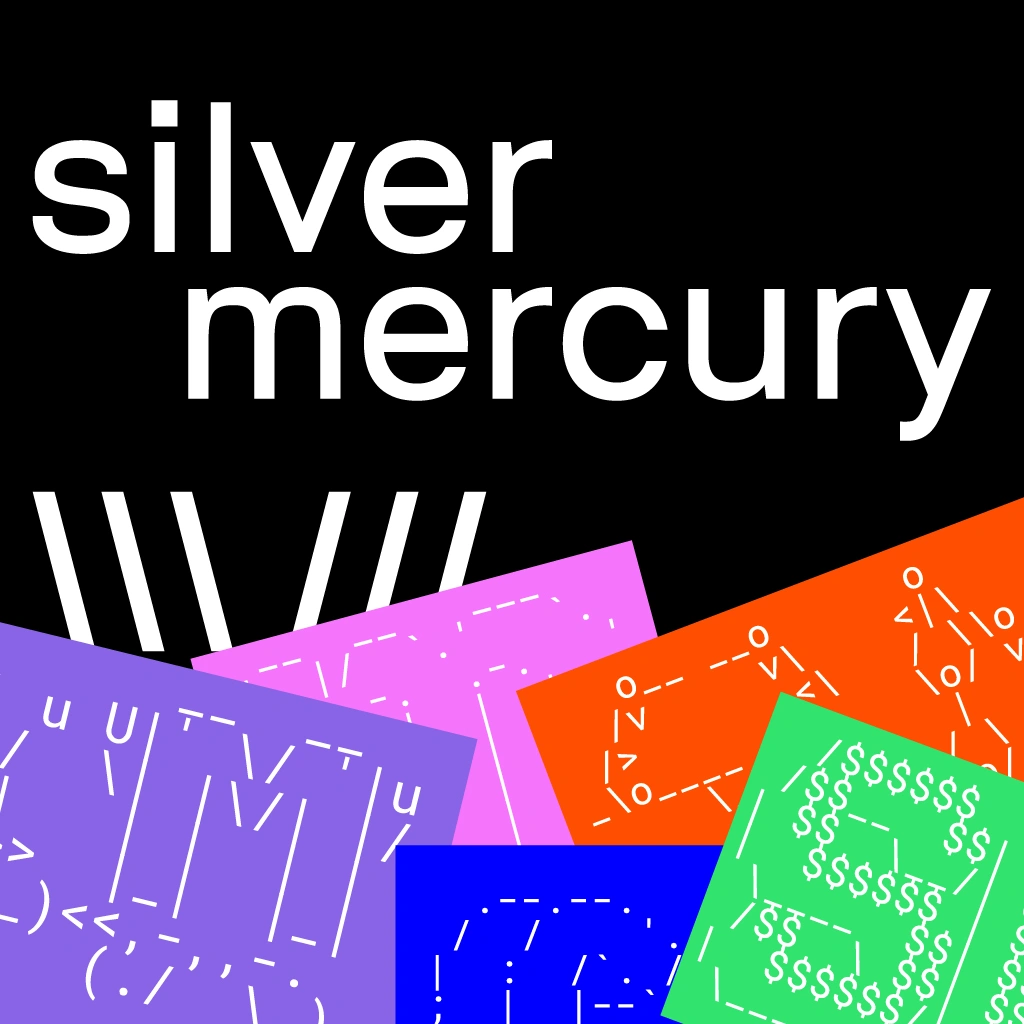
It was clear for us that it's not enough to just change the logo — we need to give participants the chance to fall in love with Silver Mercury again, to make the brand feel alive, fresh, and personal. So, the idea was an intellectual reconstruction of the brand. The new image shouldn’t shout about itself but allow the scale to be seen through simplicity. We abandoned pathos in favor of irony, depth, and technology. The new visual style allows to “play” with the identity, and the tone of voice invites humor, reflection, and dialogue. Complexity and courage. We didn’t just cosmetically “clean up” the brand; we began a new conversation with the industry. We didn’t follow the traditional route of maintaining an established brand that is perceived as something stable and unchanging. Instead, we decided it was time for a fresh look at the festival, to emphasize its dynamism, inclusivity, and modernity, in line with global trends and our ambitious goals. To achieve this, we created a new visual style that reflects our mission and values: transparency, honesty, and industry leadership. We updated the design, developed a new logo and font, and chose an adaptive color palette that reflects our openness and ecosystem. We integrated elements into the brand that highlight the importance of communication and mutual understanding. The focus of the communication strategy was on a closed presentation and informing through media channels. These tools became the launch points for the new visual system, allowing us to avoid noise and ensure personalized delivery of the brand's values to the core audience.
Result
A closed presentation was held: over 300 guests, including top management from the highest-rated agencies, top 100 advertisers, and "elders" of the advertising market. Merch (sleep masks, 350 units) and an exclusively created lemonade line "Lapochka" (350 units) for the rebranding were completely taken by the presentation guests. Social media mentions: >120 organic mentions within 3 days. ER of publications: 2.3 times higher than average. Over 15,000 views of Silver Mercury’s social media posts. 1,539 new website visitors, 853 returning visitors. Average time spent on the website increased by 16%, bounce rate decreased by 13%. The total media audience for the first releases (Lifehacker, rusbase, adpass, Rambler News, news.ru) reached 4,485,220.