REDKEDS Agency came to the market of Kazakhstan and Central Asia. We were charged with bringing our international experience. "Surprise, surprise." We appeared at the very peak of national self-identification, demand for local communication and understanding of local insights, maximum local rethinking of everything global. We were joyfully greeted by clients, but the first question after showing our international portfolio was always: "Do you understand the needs of the local market? Insights?" And recruitment was also slow.
Problem
Our main tasks: - Getting new clients - Recruiting talents in the Central Asian market For REDKEDS, entering a new market meant the need to quickly gain the trust of key players, to show that we understand the local market, its graphic and creative code, and that we can be trusted with projects.
Solution
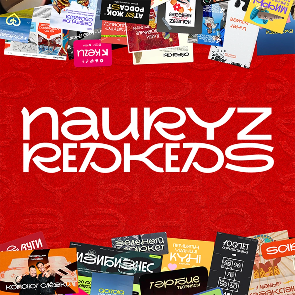
One of the main problems of Central Asia is display fonts adapted to local languages. These are relics passed from hand to hand. You can use Cyrillic fonts, but each time you need to draw letters (up to 9 per alphabet). And if suddenly there are edits to the text, the work becomes many times more. That's why we found a non-standard media that was ideally targeted to the creative and marketing industry. On the eve of the Nauryz holiday, we gave the whole of Central Asia an absolutely free adapted font NauryzRedkeds, which we allowed to use as they wish and anywhere. A few elements of national ornaments and folk, a little style and trendiness. The font turned out to be lively and variable and naturally integrated into work processes, demonstrating our understanding of the local context. Each of its uses became an unobtrusive reminder of REDKEDS, both for designers and people from the creative industry.
Result
The font has become the agency's calling card in the region (and beyond). It was used in advertising, it appeared on billboards and videos, in SMM, music videos, brand books of Kazakhstani cities, companies and funds, websites, special projects, media headlines. It was used by large brands and startups, pop-up markets and musicians, Far North tourism conferences and Moscow art events, stand-up comedians, souvenir designers and many others. And many designers honestly wrote to us that when they see our font, they remember REDKEDS. Over the course of 1 year of the project, we added new languages, entered new markets. Having recognized us by the font, 6 clients came to us, and responses to vacancies increased more than 4 times. But the most important thing is that we "branded" more than 70% of font selection dialogues among people in the creative industries.