"YEST FEST" was a successful regional food festival entering the highly competitive Moscow market. The category is dominated by clichés: images of perfect food and happy people. The brand needed a unique, scalable identity to stand out and win over the metropolitan audience, which values experience just as much as food.
Problem
The old identity did not stand out and was not scalable. The task was to create a bold visual system that reflects the festival's true value—the atmosphere of lively communication and hedonism (convivialité)—ensuring instant recognizability and an emotional connection with the audience.
Solution
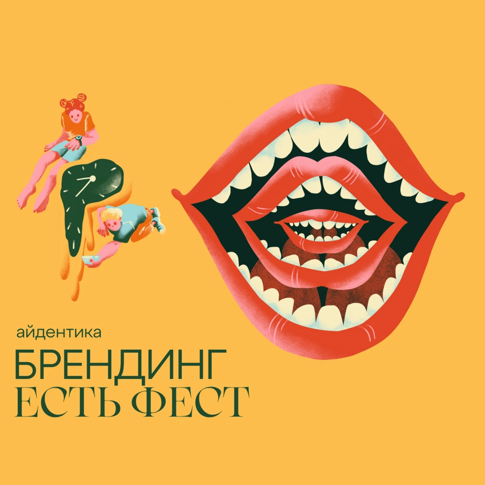
We conducted a rebrand, moving away from the "food on a plate" cliché. Instead, we built a system based on the metaphor of a mouth—a universal symbol of taste, communication, and emotion. We developed a library of distinctive hand-drawn illustrations: smiling, chewing, talking mouths. This system became flexible and adaptive for all media: from digital communications and outdoor advertising to merchandise and on-site navigation.
Result
The new identity was enthusiastically received by the audience and organizers. The mouth image became an instantly recognizable symbol of the festival, ensuring a sharp increase in brand recognition in Moscow. The project successfully laid the foundation for the festival's further scaling, proving the effectiveness of a bold visual solution.