Gate is a premium food truck that combines fine dining with familiar street food. We developed a brand identity that captures the atmosphere of travel and airports, making the brand both recognizable and scalable.
Problem
The founder of Gate approached us with the challenge of creating a visual identity that would convey the “take-off” spirit and highlight the unique concept: premium street food on wheels. The key was to balance sophistication with simplicity, ensuring the identity was clear, distinctive, and easy to use.
Solution
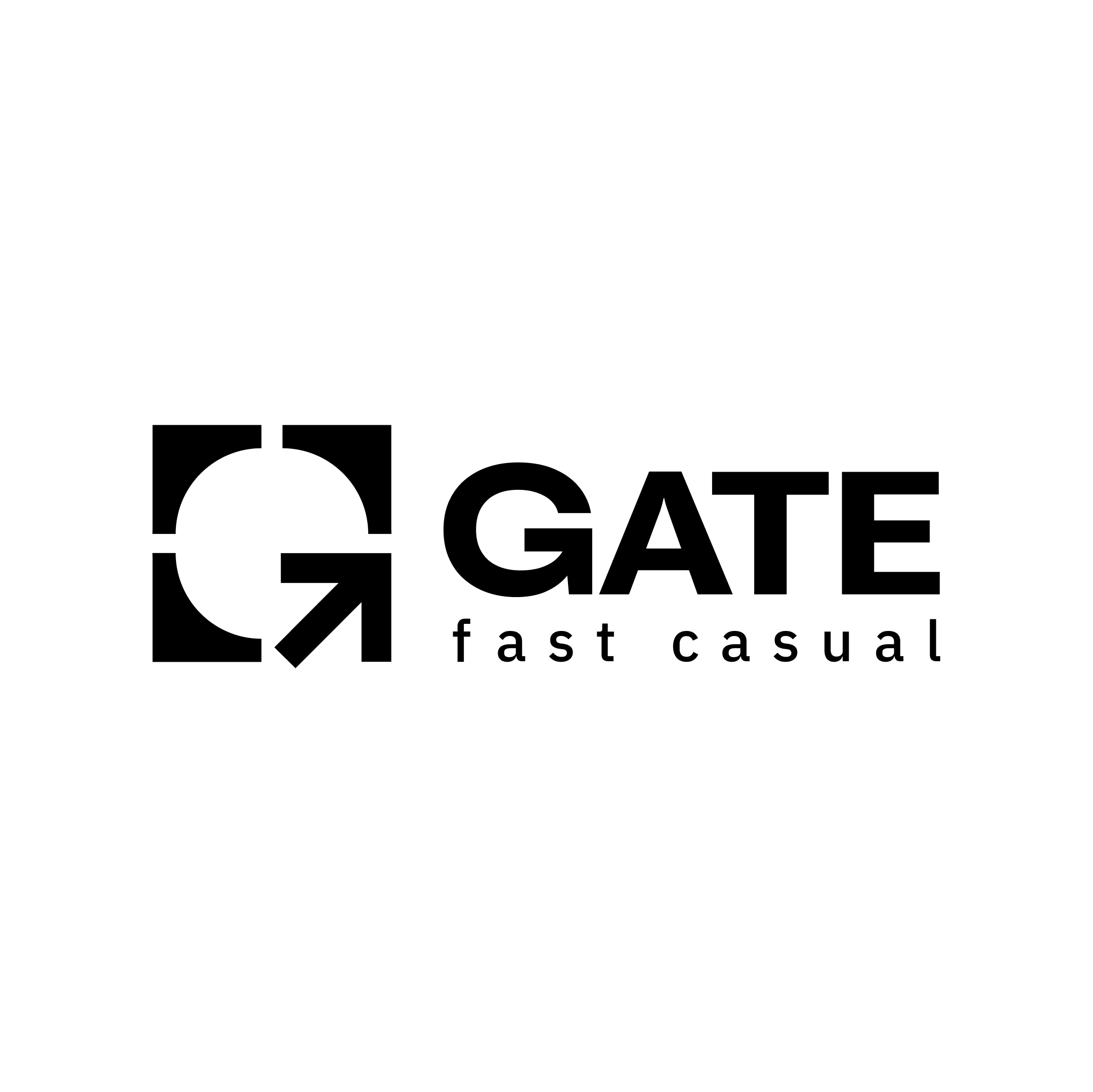
We studied the visual systems of international airports and drew inspiration from their navigation and iconography. The logo was built around the first letter of the name with an arrow symbol, referencing the theme of flights. The design system is based on clean grids, structured frames, and minimalism, making it easy to build layouts and patterns. This approach created a flexible identity that adapts seamlessly to any format or medium.
Result
The Gate identity is cohesive, refined, and highly functional. It reflects the brand’s concept, evokes the atmosphere of travel and premium quality, and remains instantly recognizable across touchpoints. From packaging and menus to digital platforms, the identity scales effortlessly, turning the brand into a powerful tool for growth.