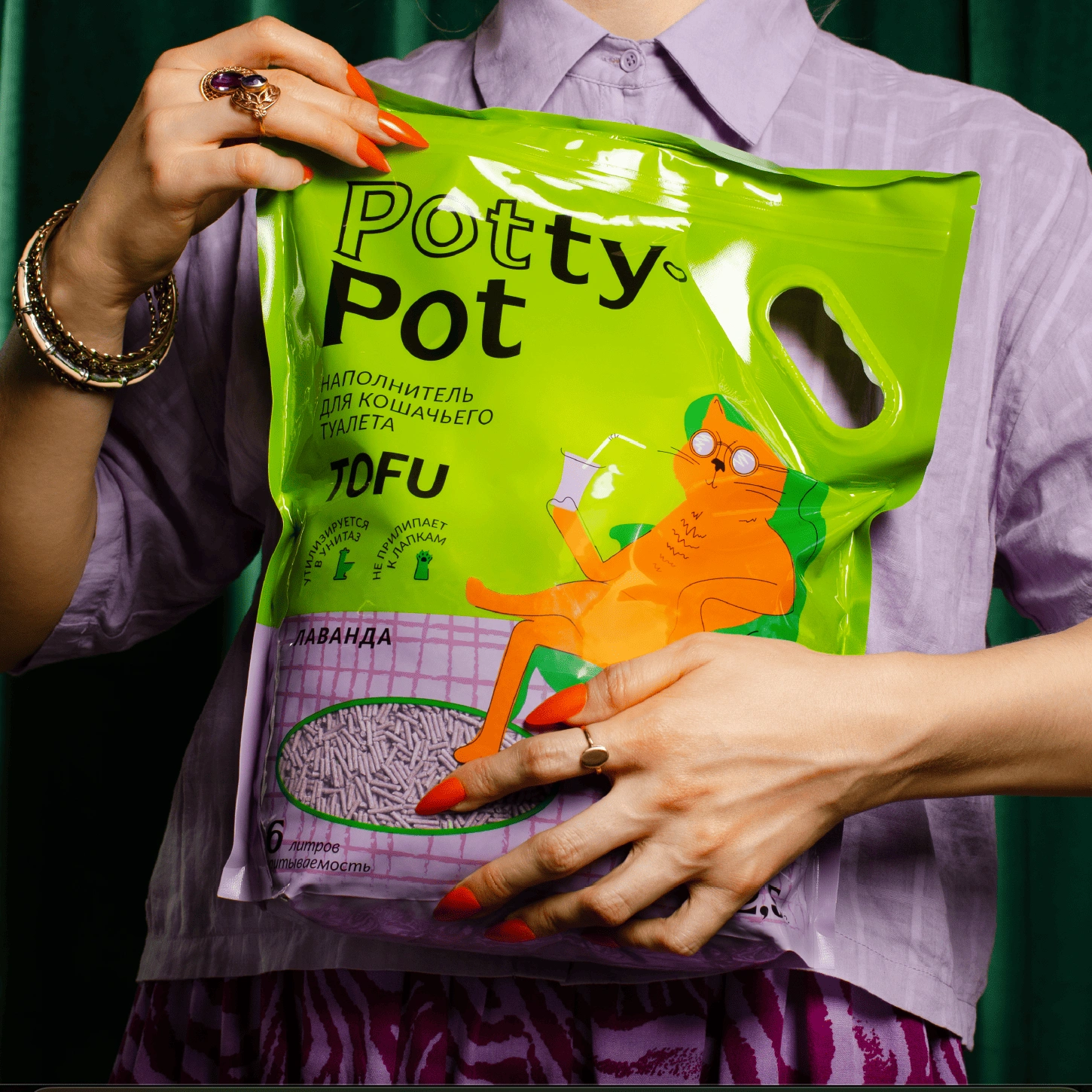
PottyPot is a line of cat litter products. While the category is traditionally dominated by functional and sterile design codes — realistic pet photos, pale colours symbolizing cleanliness, and bold claims of product benefits — PottyPot is positioned differently. It’s a mass-market product with a premium emotional twist, built around playfulness, warmth, and the idea of pets as full-fledged family members.
Problem
The cat litter market is overcrowded and heavily standardized: packaging looks almost identical, often blending into a monotone shelf environment. The main challenge was to break away from these clichés and create a design that not only communicated functionality but also built an emotional connection with buyers.
Solution
The guiding principle was: “Comfort at home — for pets and their people.” PottyPot turns a purely functional product into something playful and emotionally engaging, making a taboo and often overlooked topic (cat litter) more approachable and even joyful. The design uses a stylized orange cat sitting calmly in a chair — a metaphor for comfort, safety, and contentment. This breaks away from the realism of typical competitors and instead conveys a lifestyle image: pets as relaxed family members at home. Bright, contrasting colours were chosen to attract attention on the shelf. The palette was designed to be memorable yet cosy, balancing boldness with warmth. The overall look emphasises individuality, trust, and emotional connection while still assuring buyers of reliability.
Result
PottyPot established a clear differentiation from competitors, instantly standing out in its category. The design creates emotional resonance, encourages brand recognition, and strengthens trust by aligning with modern pet-owner values. The packaging became a visual asset for scaling the brand and carving out a unique space in the market.