Over the years, the foreign bank has been working in Uzbekistan, striving not only to provide financial services, but also to become a part of the cultural and social life of the country. Over the years of his presence, he has gone from being an external player to an organic member of the local community. Today, it is important to emphasize not only localization, but also the deep integration of the brand into the Uzbek context, taking into account national values, traditions and mentality. Release date: 08 August 2024 CREDITS / TBC Client: @tbcbankuzbekistan
Problem
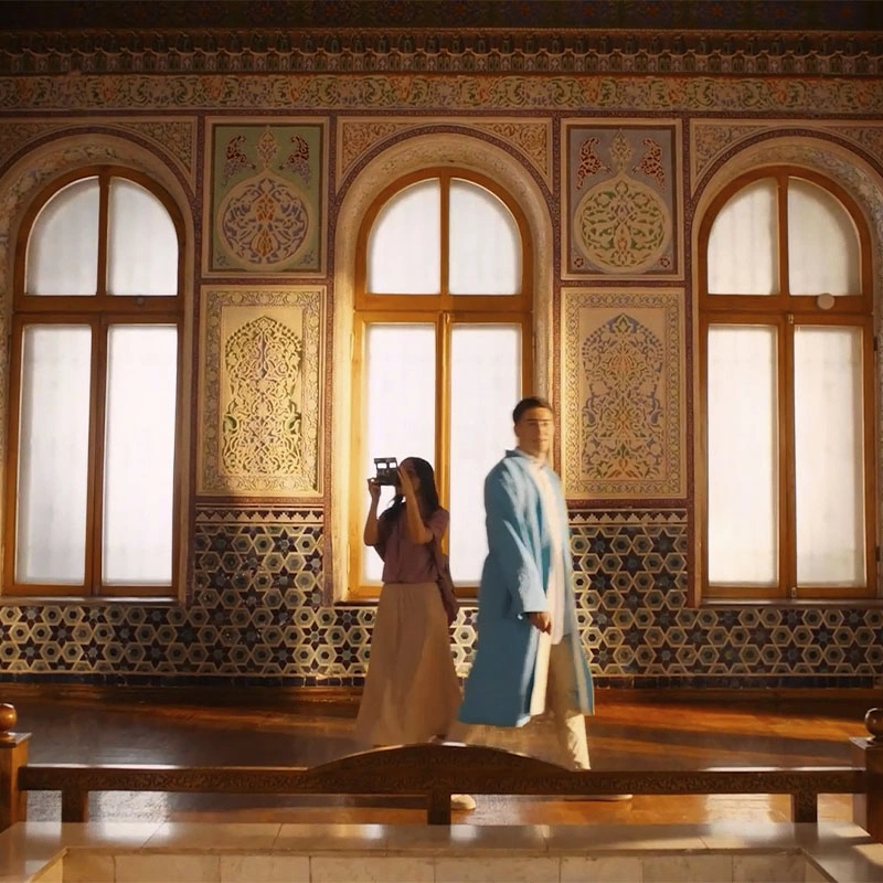
It was essential to convey an important message to a broad audience: the bank has become “one of their own” — it speaks a familiar language, respects cultural values, and lives in harmony with the people. This message is especially relevant with the launch of the new branding. The team was tasked with creating a video that communicates not just a rebranding, but a deep sense of connection with Uzbekistan — through imagery, detail, and tone.
Solution
We created an emotional video built around visual codes familiar to every resident of Uzbekistan. It features: - elements of everyday life and local traditions, - locations with a strong national character, - motifs of atlas fabric (one of the most recognizable Uzbek fabrics) — one of the symbols of Uzbek culture, - visuals of warm human relationships and communication. Special attention was given to the new branding: the design respects tradition while embracing a modern approach. The atlas patterns became the foundation of the brand's visual language, connecting past and future, tradition and progress.