Lokals Marketing is a well-known LOCAL marketing agency, which is proud of its deep understanding of local people, culture, traditions and values. But... agency's current brand identity does not reflect it at all. It is too simple, too neutral, too boring.
Problem
We are advertisers ourselves, so, we are much worse than just another "make-my-logo-bigger" client. We hunt deep, deep, deeeep meaning. So we had to turn to our history, to find a perfect visual form, reflecting an agency with various, very different, but always local people.
Solution
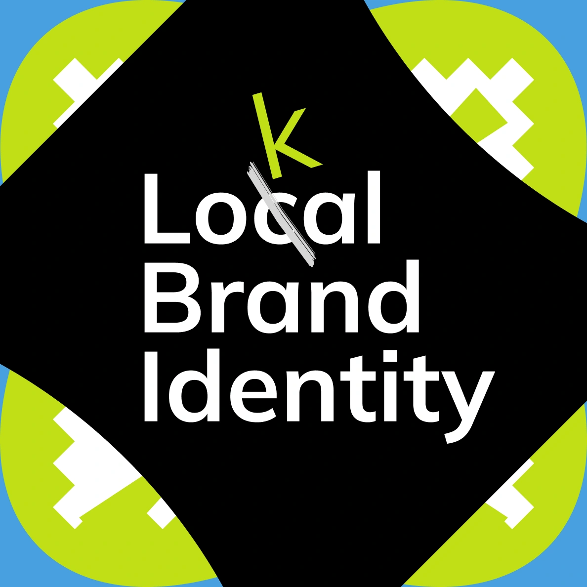
It brought us to Uzbek national patchwork technique — Quroq. It unites different styles in one canvas, mixing unmixable. Perfect fit for us. But that was not end yet. Whatever Lokals agency does, after all, belongs to local people. How to show it in identity? We used one simple symbol, that can make everything, literally everything local.
Result
Agency is refreshing right now with our new identity — website, social media and presentation templates, all are becoming brand new and truly local.