
Кейс
DYNAMI:T Energy Drink Rebranding
- Бренд
- DYNAMI:T
- Агентство
- PG Brand Reforming Company
- Рекламируемый продукт
- DYNAMI:T Energy Drink
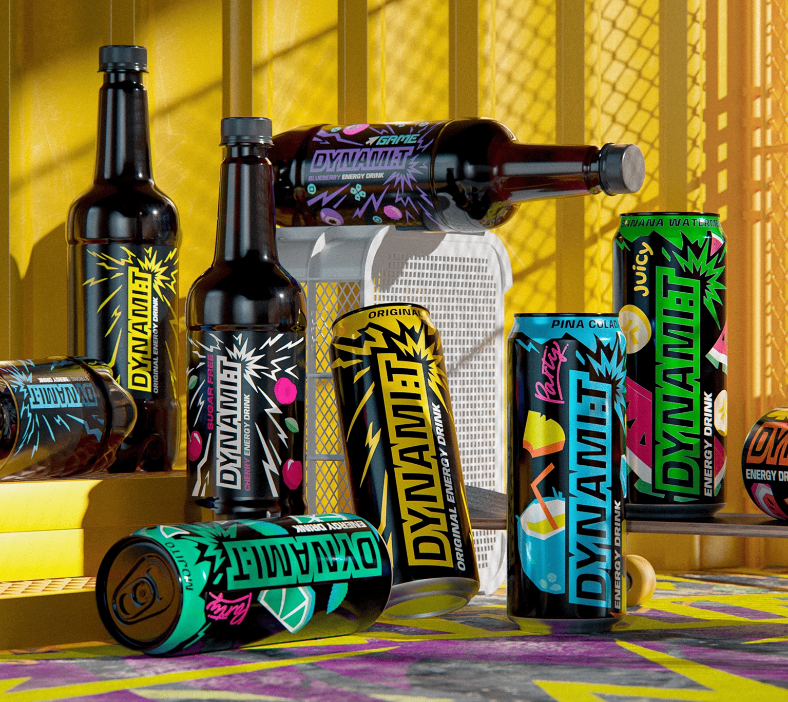
Dynamit is an energy drink produced by Lidskoe JSC, one of the leading beverage companies in Belarus. Positioned in the functional drinks category, it offers a bold taste and a powerful boost of energy, helping consumers stay active and focused throughout the day or night. Dynamit is designed for young, dynamic audiences who value drive, performance, and self-expression.
Проблема
Lidskoe JSC stands as one of the most established and trusted beverage producers in Belarus, with a robust portfolio that includes beer, kvass, soft drinks, and energy drinks. The company has earned a reputation for quality and consistency, solidifying its position as a key player in the market and a household name among consumers nationwide. The introduction of the Dynamit brand marked Lidskoe's decisive entry into the energy drink category—one of the fastest-growing, most competitive segments dominated by global giants and continually evolving in design and marketing. The challenge was clear: Dynamit had a loyal consumer base, but its visual identity failed to meet the bold demands of the market. This segment requires a fresh, striking look characterized by clarity and modern aesthetics. Furthermore, as Lidskoe expands the brand’s portfolio, it is imperative to implement a structured and organized SKU system to eliminate confusion on the shelves. The redesign of Dynamit is not merely a cosmetic refresh; it is a powerful statement that Lidskoe is aligned with global trends and capable of competing on the same visual level as international brands and preserving loyalty among consumers.
Решение
The redesign was executed with precision through the product itself—specifically, the packaging, the most powerful medium in the energy drink category. Each can boldly embodies the updated identity: a sleek, vertical layout, an enhanced logo, and a structured SKU system that maximizes clarity and shelf impact. The vibrant new color palette allows each variant to stand out while reinforcing strong brand recognition. To further amplify the impact of this visual overhaul, we launched a new Dynamit flavor alongside the redesign. This strategic move not only showcased the adaptability of our new identity system but also made a clear statement to consumers that the brand is evolving. This simultaneous roll-out of design and product innovation demanded attention on store shelves, attracted new audiences, and solidified Dynamit’s image as a modern, dynamic brand poised to compete confidently with both local and international players.
Результаты
The redesign provided a fresh, modern appearance that enhanced Dynamit’s presence on the shelf while maintaining its core recognizability. A comprehensive brand book established clear guidelines for future growth, ensuring consistency and scalability. The launch served as a powerful communication tool, raising awareness of the update and engaging new audiences. By balancing continuity with innovation, the project preserved the elements that consumers valued while removing outdated features, giving Dynamit a stronger foundation for future development in the competitive energy drink market.