Кейс
FWEYGO hot chamoy gummy bears
- Бренд
- FWEYGO
- Агентство
- PG Brand Reforming Company
- Рекламируемый продукт
- FWEYGO gummies
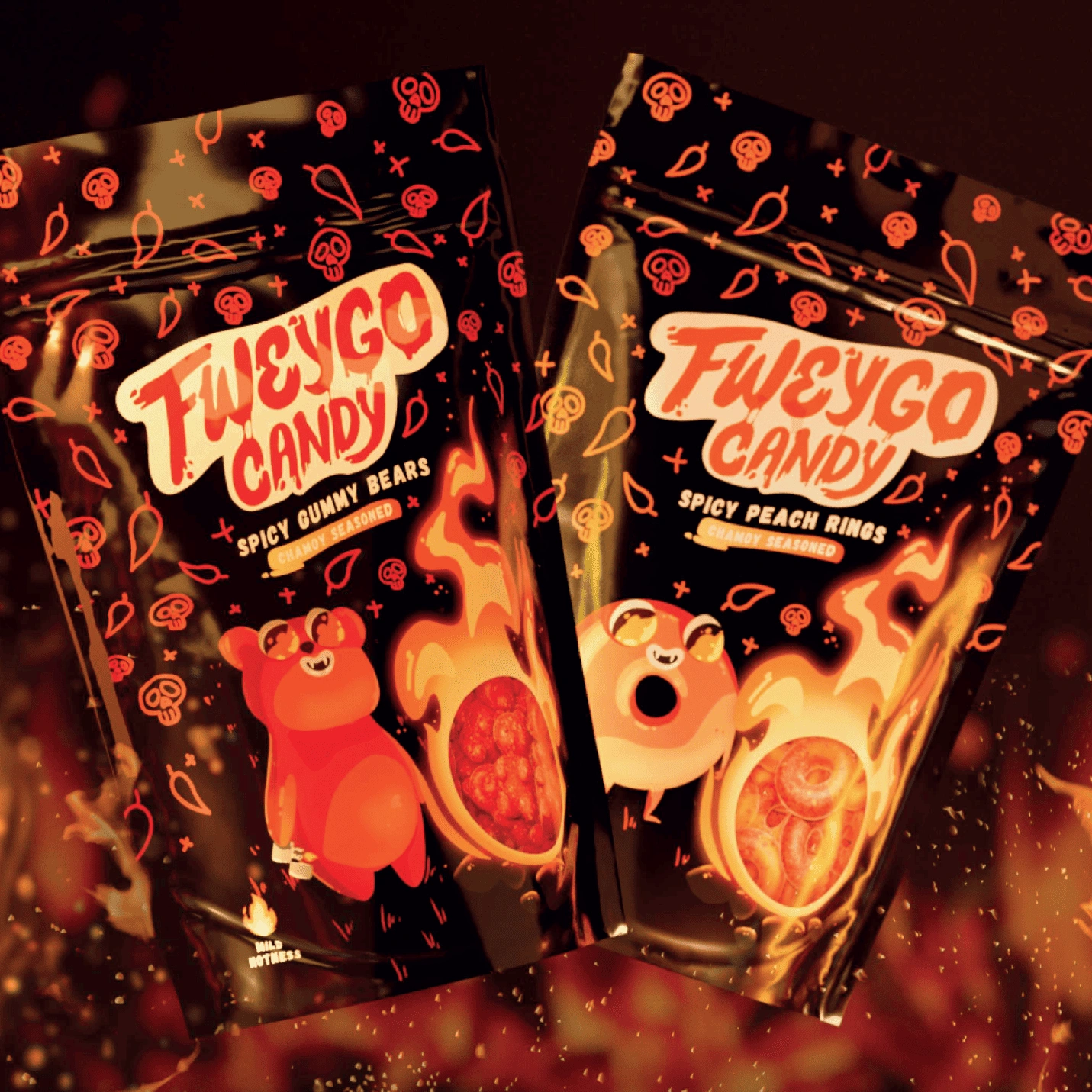
FWEYGO is a bold new entry into the snack category — gummy bears and rings coated with chamoy, a traditional Mexican spicy sauce. Chamoy blends sweet, salty, sour, and fiery heat, creating a completely unique flavor experience. The name FWEYGO is a playful twist on the Spanish word fuego (“fire”), perfectly capturing the product’s essence: fun, fiery, and unapologetically bold. These gummies are designed for adventurous snackers and second-generation Mexican Americans, bridging tradition and modern taste preferences.
Проблема
The snack aisle in FMCG is one of the most visually cluttered and competitive spaces. Packaging in this category tends to be loud, chaotic, and saturated with: • Bright, competing colors • Over-the-top characters and illustrations • Flashy lettering and exaggerated claims Standing out in this environment is no easy task. For FWEYGO, the challenge was to break through the noise with a design that felt fresh, exciting, and distinctly different while appealing to an audience eager for new food experiences. FWEYGO targets two key groups: • Food experimenters who are constantly seeking bold and unusual flavor combinations. • Young, second-generation Mexican Americans, whose food preferences reflect both their cultural heritage and the influence of modern global tastes. This audience loves playfulness and heat — both literally in flavor and figuratively in brand personality. FWEYGO needed to speak their language: adventurous, fun, and a little rebellious. The objectives for the FWEYGO launch were to: • Create a standout packaging system that disrupts typical snack category visuals. • Highlight the spicy, fiery character of chamoy-coated gummies. • Establish memorable mascots to personify the brand and create a playful connection with consumers. • Provide clear visibility of the product to build trust and trigger appetite appeal.
Решение
While most snack packaging relies on an explosion of colors and characters fighting for attention, FWEYGO took the opposite approach: simplify and intensify. The design borrows cues from the world of traditional Mexican hot sauces, giving the product a bold and authentic edge. • The central characters are pyromaniac mascots — a mischievous Bear and a fiery Ring — representing the two product formats. • These mascots bring humor and personality, embodying the playful yet daring spirit of the brand. • The visual world revolves around fire and heat, using flames, chili peppers, and skull motifs to emphasize intensity. The name itself, FWEYGO, sets the tone: a product that’s not just spicy, but blazing. The final packaging design strikes a balance between drama and clarity: • A black and orange color palette creates strong contrast and immediate shelf impact. • Fiery reds and yellows add energy and signal heat, while avoiding visual clutter. • Each SKU features its own pyromaniac mascot, reinforcing product differentiation and storytelling. • A product window on the front allows consumers to see just how generously each gummy is seasoned, adding transparency and appetite appeal. This approach created packaging that stands apart from the chaotic visual noise of competitors while delivering a cohesive, recognizable identity.
Результаты
FWEYGO successfully carved out a niche in a saturated market. Strong differentiation from typical snack designs thanks to its clean yet fiery aesthetic. Mascots became a key emotional driver, adding personality and collectability to the brand. The packaging’s product window built trust and appetite appeal, encouraging trial purchases. As a result, FWEYGO established itself not just as another snack, but as a unique, adventurous experience — a treat for those who crave bold flavor and bold design.