
Кейс
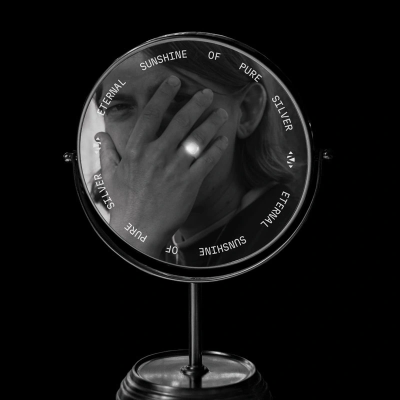
Monolic. Eternal sunshine of pure silver
- Бренд
- Monolic
- Агентство
- Ma'no Branding
- Рекламируемый продукт
- Monolic
MONOLIC is a jewelry brand that works exclusively with pure 925 sterling silver, focusing on minimalism, precise form, and unconventional design. Its audience cares not just about aesthetics, but about the idea behind the piece and the tactile connection to the material. We realized the packaging had to reflect the same philosophy: not to decorate, but to emphasize. Instead of a typical “gift box,” we created packaging that speaks the same visual language as the jewelry itself.
Проблема
Task: Refresh Monolic’s brand identity so it finally reflects the brand idea idea
Create a cohesive visual language and two packaging lines for Monolic that express the purity and precision of 925 silver: Classy & Shiny for the core collection and Special for limited editions—delivering a unified visual system and memorable unboxing.
Решение
At the heart of the concept is silver — not just as a precious metal, but as a material that transforms into an original, wearable object. We took that transformation literally: from raw nugget to cast ingot, from metal to ring, pendant, or earring. The packaging mirrors this process in its layered structure — becoming a visual metaphor for the jewelry’s journey from raw form to refined design. It’s not just a box; it’s part of the product.
Результаты
The outer layer of the packaging is a foil wrap with a rough, uneven texture — mimicking unrefined silver ore. Inside is a sleek, ingot-shaped box that holds the jewelry piece securely. The color palette is strictly monochrome — black and grey — with no excess details. The only bold element is an embossed “925” mark combined with the brand’s logo, styled like an authentic silver hallmark. Every element — from texture to form — references the raw material and the process it undergoes to become jewelry. The unboxing experience feels like a ritual — reinforcing the emotional and physical connection to the brand.